28/10/19- (Week 11- Week 14)
Riyaz Mohamed Zain ( 0334031)
Advanced Typography
Final Project
LECTURE NOTES
No Lecture
28/10/19 (Week 10)
No Lecture
04/11/19 (Week 11)
No Lecture
11/11/19 (Week 12)
INSTRUCTIONS
Final Project
Week 10
We were briefed about and assigned our Final Project. This project was open and we were free to choose any topic. We could either develop a font that solves a larger problem in our area of interest or experiment on the use of a typeface, understand its relationship, and identify ways to improve it. Either way the typeface that is produced must has a purpose.
I started of brainstorming ideas for the project. My main focus was on trying to find a topic that solves a bigger a problem. The following are my initial ideas for the project.
After looking at my Proposals Mr Vinod explained the issues with the ideas I had and suggested I work more on them. With this feedback I started to explore and do more research to find an idea. At this point I knew I wanted to do something that related to Maldives. After some research I found that "thaana" stencils boards no longer exist in the Maldives.
To start of I started sketching to design the font for the thaana stencil. I wanted to create something that was simple and easy to read and understand for anyone.
 |
| Fig 1.1 Writing |
 |
| Fig 1.2 Writing |
 |
| Fig 1.3 Outlining refined sketches to simplify text |
 |
| Fig 1.4 Outlining refined sketches to simplify text |
After I studied the text and identified a way to simply them I moved to further refining them. I started to develop and redesign it until I reached a point I was satisfied with.
 |
| Fig 1.5 Pencil Sketch of redeveloped font |
 |
| Fig 1.6 Exploring way to make the required gaps in letters for the Final Font |
 |
| Fig 1.7 Final Font designed before Digitization. |
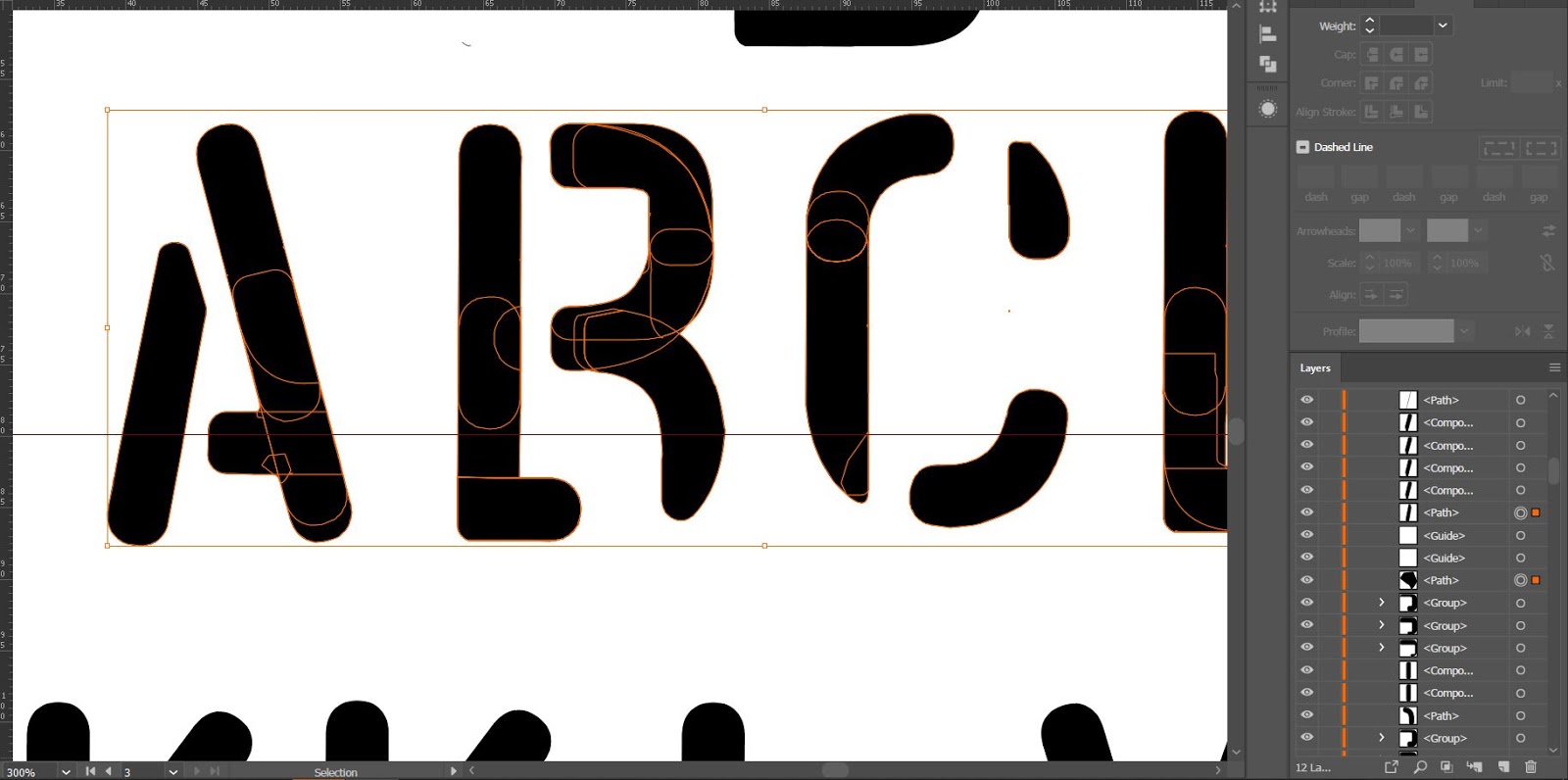
After finalizing the design I then moved onto Digitizing the Typeface for the thaana stencil. I started by scanning the image of the Final sketch into illustrator
 |
| Fig 1.18 First draft of the Thaana stencil Font |
I sent the digitized typeface to Mr Vinod for Feedback . He liked thought the new design was much better. He also send the design to a Maldivian Senior student who looked at the typeface and pointed out the errors she noticed in the design. She pointed that the following glyph need adjustments as were hard to interpret.
 |
| Fig 1.19 Letters that need adjustments. |
 |
| Fig 1.20 Adjustment of glyphs |
 |
| Fig 1.21 Options for Adjustments of letter |
After trying out various options to adjust the letters to make it easier to read and understand. In order to finalize the design that was most suitable by sending the options out to Maldivian fiends and asking them to give their opinion on which font design was the most readable and represented the real letter.
Then I moved onto making the final part for the Thaana Stencil Font, making the "fili" for the letters.
 |
| Fig 1.22 Fili Development |
After I finalized my Thaana Stencil Font I moved onto making the Roman alphabets for the Typeface. I used elements from the Thaana font letters to construct these alphabets. This helped me to maintain consistency within the type family.
 |
| Fig 1.23 Constructing Roman alphabets using elements from thaana font |
 |
| Fig 1.224 Refining the letters paying close attention maintain consistency in the gaps |
I used the same rectangle as a measurement to maintain the consistency of the letters within the whole font family.
 |
Fig 1.25 Further Development and Refinement
 |
| Fig 1.26 Exploring options for the gaps in the letters. |
|
Here is the
Final Outcome of the Thaana Stencil Font
 |
| Fig 1.27 Final Outcome of Thaana Stencil Font |
 |
| Fig 1.28 Final Outcome of Roman letters. |
Designing the Stencil
Using the final Fonts I designed 3 stencils boards on illustrator.. The designs are as follows.
 |
Fig 1.29 Thaana-Stencil Board. I also added millimeter markings on the board so that it could also function
as a ruler or measurement guide. The lines are to aid users in aligning the stencil letters and the "filli" accurately. |
 |
| Fig 1.30 Roman alphabets Board for Thaana-Stencil Font |
 |
| Fig 1.30 Bi- Lingual Stencil Board. |
Here is a PDF of the stencil board designs.
After designing the stencil boards I had to get the the design ready to be laser cut.
 |
| Fig 1.31 getting File ready for Autocad. I had to change all the all the shapes into stroke lines with a width of 0.3mm |
 |
| Fig 1.32 Refining letters in auto cad before sending it to laser cut. |
 |
| Fig 1.33 I realized all the rounded edges had become jagged. |
 |
Fig 1.34 Rounding of the edges and adjusting the distance between the gaps between some of the letters to allow fro
better cutting |
 |
Fig 1.35 Allocating different colors for the different task for laser cutting. In this case red was allocated for
cutouts and green was allocated for engraving. |
 |
| Fig 1.36 Laser cutout Stencil Boards Prototypes . I made cutouts of all 3 sets of Stencil Boards |
The cutouts were made to a scale of 10 cm by 21 cm so that it would easy to handle and use. I had to make few changes after getting the first cutout as there as there would be some error that had been overlooked before the cutout. It could a few refinements stages with the laser cutting before finally produce the the final product.
Application
 |
| Fig 1.37 GIF of Thaana Stencil in Use |
 |
| Fig 1.38 Application of the Thaana stencil typeface |
 |
| Fig 1.39 Application of the Stencil Font |
FEEDBACK
Week 11 - Mr Vinod said that ideas I put forth are still not strong in terms of its purpose. He told me to do more research and find more ideas that has are realistic and interesting purpose behind it.
Week 12 - When I send the first design Mr Vinod said that it was too simplistic and the were Gaps too delicate. He also told me to make it bilingual font: Roman and Thaana. The glyph need better structure. While I know this is the way the writing looks, it doesn’t mean it isn’t open to being constructed differently.
I then made adjustments to the designs and Mr Vinod said that it looks a lot more better. But try to ensure there is consistency in the size of the stencil gap across all glyphs. Also make the glyphs bigger when placing them next to each other.
REFLECTIONS
Experiences:
Week 10 - Finding a Typographic topic was a very interesting yet challenging experience . During the process I stumbled upon many fascinating works that was result of years of research and work. These works were inspiring as it really had strong purpose behind them. eg : Sans Forgetica
Week 11 - Because Mr Vinod did not approve my Proposals. I found myself falling behind from the rest of the class. I struggled with coming up with a new idea with a strong purpose
Week 12 - As I fell behind one week I had a lot of piled up work to complete within a short span of time. I also had a lot of research that needed to be done in- order to proceed with my work
work
Observations:
Week 10 - It was difficult coming up with a purpose for the ideas. I had many ideas but I couldn't come up with a useful purpose for the idea.
Week 11 - I realized that I was not only struggling with coming up with a purpose for the ideas. I realized like me my classmates had the same problem . they had goof ideas but no good purpose to back up the idea.
Week 12 - With the deadline getting I had little time to get the work done.
Findings:
Week 10 - I found out that having good idea is not enough. In order for the work to create a impact it has to have a purpose, whether it be an experimental piece or not.
Week 11 - Having an open brief is actually harder, I believe this is because of the vast amount of options and the freedom that it allows. because we don't have a guideline to follow we spread out and end up focusing on too many things at the same time
Week 12 - Despite having very little time I was able to pull of making the fonts successfully. I believe this was because had a clear idea of what I wanted to be shown in the final outcome.
FURTHER READING


Comments
Post a Comment