07/10/19 – 28/10/19 (Week 7 – Week 9)
Riyaz Mohamed Zain ( 0334031)
Advanced Typography
Project 2
LECTURE NOTES
Lecture 4 - Typography in different medium
07/10/19 (Week 7)
We started with the difference between static and kinetic typography. Static typography can be done in two forms Print and Screen. This type of typography stays in one place and does not move. Kinetic typography on the other hand can appear in commercial websites, animated emotions etc . typography is animated and moves in or changes into other elements. they can be used to tell compelling stories and is more visually pleasing
Environmental typography employs architectural elements such as colors,patterns and everyday materials.
Now with technological advancements the VR/AR. This allows make simulations and mix reality and virtual environments.
INSTRUCTIONS
Project 2
Week 08 - Week 09
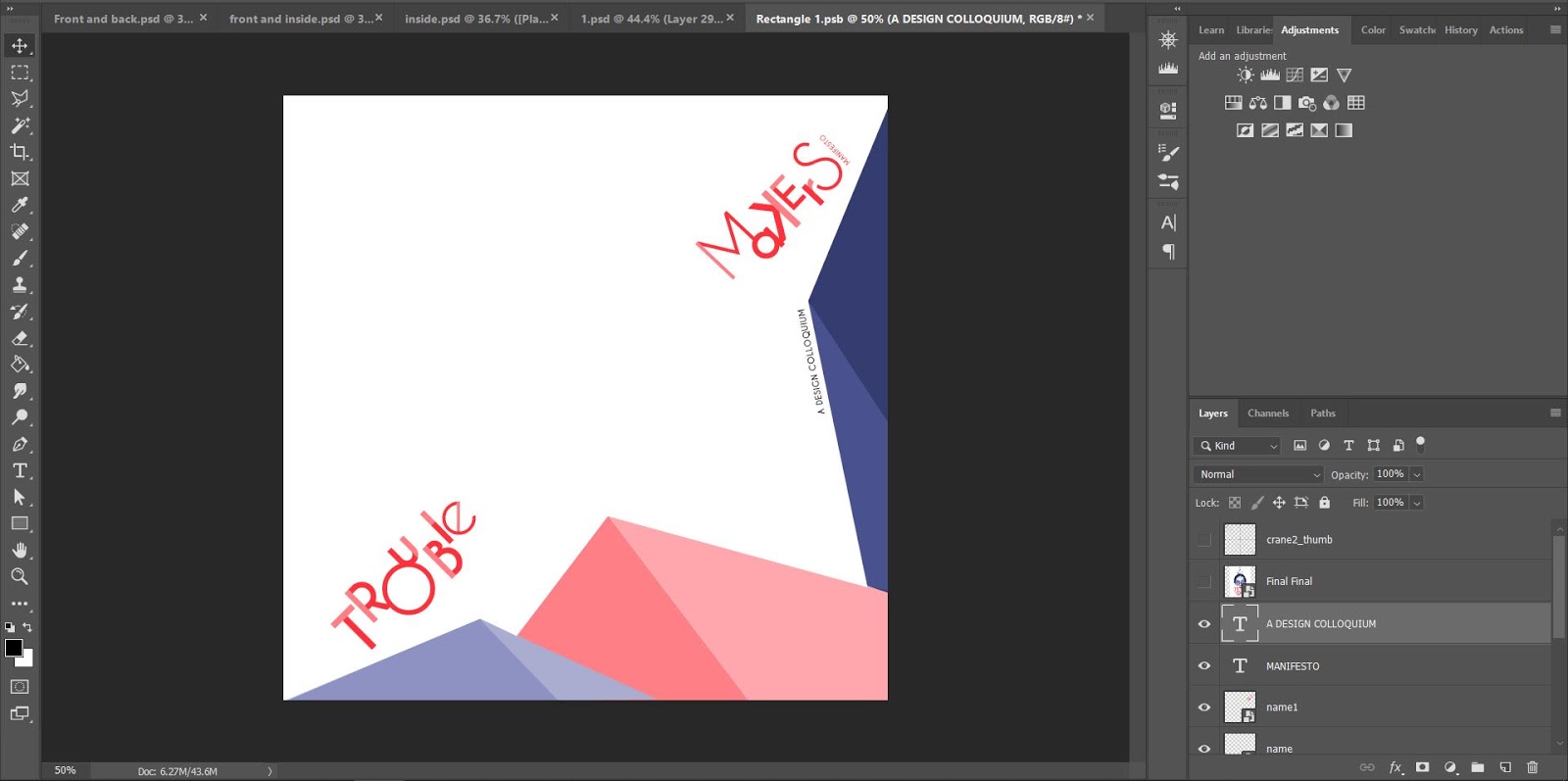
Project 2 was a continuation of Project 1, we were tasked to do 3 collateral, A poster and 2 other collateral's of our choice. In addition to this we were also to make a micro site (this will done in our Interactive design Module). I started off by first designing the Poster.
 |
| Fig 1.1 Initial Poster Designs |
To start off I made two Variation with different composition of for the information Mr Vinod gave us for the Poster. For Second design I also made it look as if the paper with the design was curling. This was to in line with the origami concept that key artwork was based around. Mr Vinod liked the second design and he asked me to make some adjustments to the font sizes arrangements.
 |
| Fig 1.3 1st Poster draft after adjustment |
 |
| Fig 1.2 Printed Version of 1st Draft. |
After I made the minor adjustments Mr Vinod asked me to take a printout to see whether their were any further adjustments to be made. After looking at my printed design he asked me to make some changes to design before finalizing it.
 |
| Fig 1.3 PNG of 2 Paper curls |
 |
| Fig 1.4 Making rectangle with shadows. |
I also noticed that the paper curling isn't very realistic after removing the background so I remade the background paper on Photoshop. I got to png images of paper curls and then added a rectangle witha shadow. I then raterized the rectangle and removed the corners to achieve the effect.I then added the background to the final poster and amended text errors.
 |
| Fig 1.5 Final Poster |
Here is a PDF of the final poster.
 |
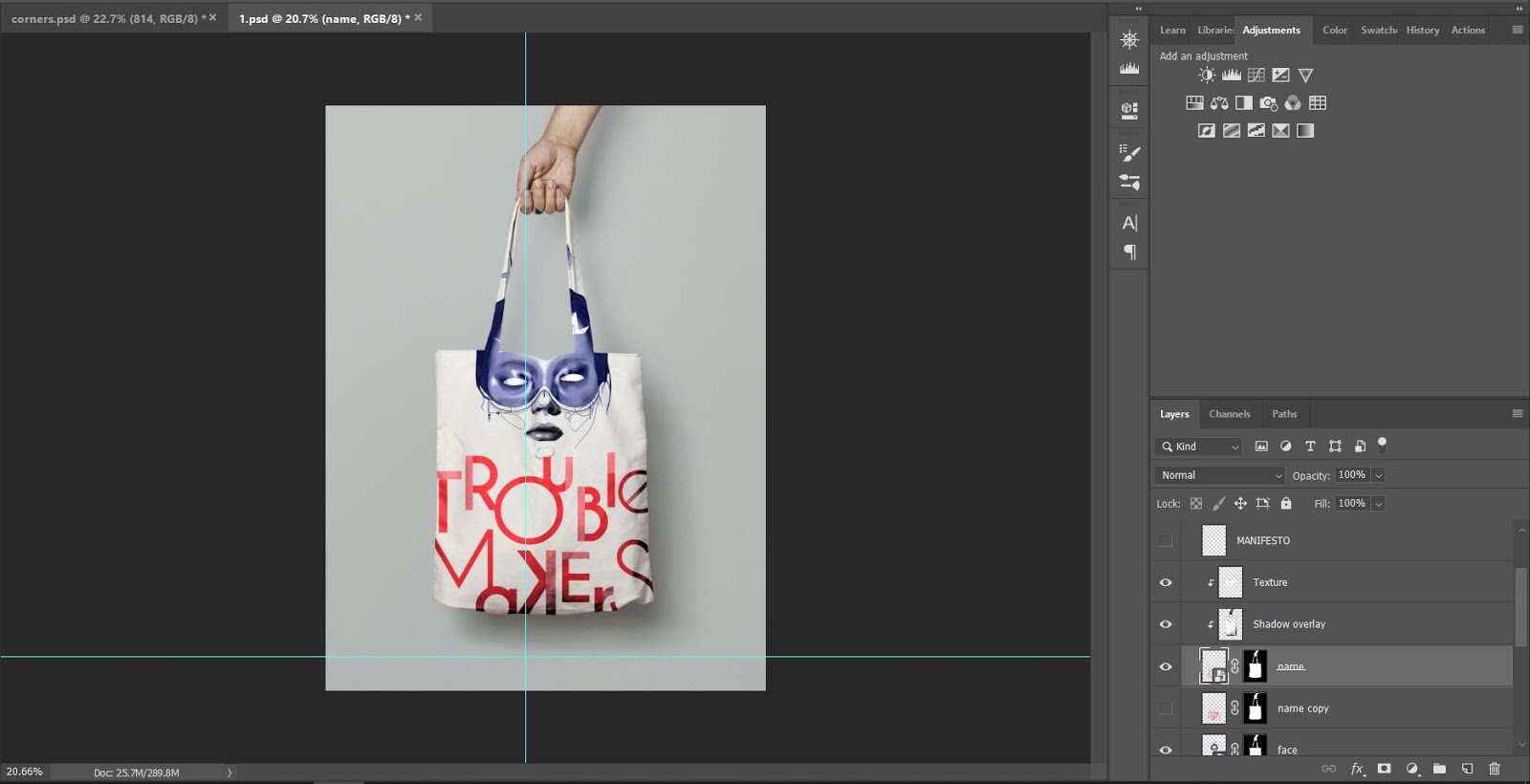
| Fig 1.16 Final Shirt Design |
In addition to this I also made a 3rd Collateral, a cap. I made a very Minimalist design for the cap.
 |
| Fig 1.17 Cap Design |
Mr Vinod told me that the hat is not very suitable for the event. He suggested I make a gift pack with origami paper inside it. Guest can make cranes and post it online with a hashtag. I decided make this as one of my collateral.
 |
| Fig 1.18 Mock up of package |
I decided to present the origami papers inside a Bi fold Card with instructions to make a crane and space to take notes during the event if necessary. To begin with I design the Front and Back Covers for this Card.
 |
| Fig 1.19 Designing the front cover |
 |
| Fig 1.20 Adding More elements. |
 |
| Fig 1.21 Final Design |
For the front , I made a simple rectangle as border and put the name on the Left hand corner of the card, In order to balance the design I added a portion from the key artwork on the opposite end of the card. Since the card still looked very Plain I added a flock of Origami birds and some other elements to the Final design.
 |
| Fig 1.22 Designing the Back cover |
 |
| Fig 1.23 Final Back Cover design |
I want the Back to very simple so Began with adding the name and the hashtag. Then to make the design connect with the rest of the artworks I added a few origami birds Flying away.
 |
| Fig 1.25 Making Origami Crane and writing trouble makers |
 |
| Fig 1.25 Unfolding the crane to use as reference for Custom origami paper |
I then made an origami bird and wrote trouble Maker on it wings. This was an experiment to see whether I would be able to make a custom origami paper that has Trouble Makers on its wings when folded.
 |
| Fig 1.26 Instructions to make Origami Crane. |
I downloaded a folding instructions Manual and edited so that it fit the Event. Using the Origami I had made I changed the instructions so that the Guests will be able to see trouble makers on the wings of their cranes.
 |
| Fig 1.27 Using a crease line layout to add the name |
 |
| Fig 1.28 Final design for the origami paper. |
Next I moved onto making the inside of the card. I left side of the card was going to have the instructions and the right side would be a simple page where guests can jot down notes etc.
 |
| Fig 1.29 Left inside page of card |
This page was very straight forward with the just the instructions and details to inform the guests of the Picture raffle draw.
 |
| Fig 1.30 Making a Water mark |
 |
| Fig 1.31 Adding some origami cranes |
For the right side I made a very simple watermark. I first randomly placed the word trouble Makers manifesto and the later added some origami birds to fill in some of the negative spots.
Here is Final design of the card on Mock up.
 |
| Fig 1.32 Final Front and Back Covers |
 |
| Fig 1.33 Final Inside and Origami paper. |
Here is Flat lay of the all collateral designs.
 |
| Fig 1.34 Flat lay of the designs |
PDF of flatlay
 |
| Fig 1.35 Printed Collateral - T shirt and Tote Bag |
 |
| Fig 1.36 Printed Collateral brochure and Origami paper. I also constructed an origami crane from the paper to show what the result will look like |
We were also assigned to do a Micro site for the event, This Project was carried out in the interactive design module. Here is a screenshot of the landing page of the site and the website link.
 |
| Fig 1.35 Landing Page |
 |
| Fig 1.36 Landing Page |
Link to the website:
FEEDBACK
Week 09
GENERAL FEEDBACK:
Even though the visuals are made in Photoshop, the placement of text for the poster should be done in illustrator.
SPECIFIC FEEDBACK
The poster looks good. Mr Vinod asked me to reduce the Font size on the date add letter spacing between the letters. He told me to take a print out the design after making the above amendments. After I printed it out I asked Mr Vinod for Feedback, he told me to add paragraph spacing not leading and to reduce the font size of the dates by .05. All underlines should be removed. Lastly he asked me to change the font I had used for "Manifesto and "Design Colloquium". He also told me to remove the background texture. He said after these minor adjustments the Poster can be finalized.
For the collateral chose a T-shirt from the different versions I had made. Mr Vinod liked the design I had made for the tote bag and but asked me to make a design for the back of the bag as well. As an optional collateral I had made a design for cap as well, Mr Vinod said that a cap is not a suitable collateral for the event. He suggested that I make a small gift pack that has origami paper inside. The guests that come to the event can make origami cranes while waiting for the event to start.
REFLECTIONS
Experiences:
Week 09 - Because I was held up with my key artwork I had just one week to complete my poster and collateral. I was able to manage my time and complete the work on time but I missed out on getting Feedback for my Posters as I went along.
Observations:
Week 09 - I noticed that I wasn't the only one struggling with finalizing a Key artwork, Some of my other classmates were also having the problems. I also realized that getting my work approved was much faster this week because I had a set idea behind the works.
Findings:
Week 09 - Even though my key artworks were rejected many times over, I realized that it helped me to reach a better result. If I just gone with a previous work I would have struggled with coming up good poster and collateral designs. Since I had a clear idea and good Key artwork the work that followed was much easier to complete and I was able to come up with strong and engaging designs.
FURTHER READING
Week 09
Freehand new typography sketchbooks by Steven Heller and Lita Talarico
This book is filled with imagery that shows a process as the designer looks for a specific form, this begins to create a pleasing pattern on each page . Each of these designs are accompanied by a the opinions of the designers themselves an this really gives an insight into the though process of the creator. The book is compiled of highlights from various designer sketchbooks and this gives a very broad look at the creative struggles that each of them go through before coming to final product. Some of the pages also has collages, scraps of paper scribble though etc. This book is very helpful to students like us as it shows how to come up with compositions , color schemes and how to use drawing to achieve the desired designs.


Comments
Post a Comment