23/09/19- 07/10/19 (Week 5- Week 7)
Riyaz Mohamed Zain ( 0334031)
Advanced Typography
Project 1 - The Trouble Makers Manifesto
LECTURE NOTES
Lecture 2 - Typographic Perception & Organization
23/09/19 (Week 5)
Through todays Presentation we learned about Form, Contrast and layout.
Contrast can be seen in size, color, weight and even form. it allows us to create a distinciton between and within letterforms. and can be seen applied in many ways
Form on the other hand refers to the techniques and workstyles used. A good form will be visually intriguing to the eye.
When it comes to Layout, one the interesting topics was the gestalt psychology, It uses negative space to create shapes and objects without necessarily drawing them. It creates very unique and creative layouts.
When arranging a Layuot it is important to create a visual heirachy. This can be achieved by using color /tint, varying typeface weights and size. Since our eyes tend to move diagonally across a page, it is important to create movement to lead the eye. This is ussually done by using leading lines that follow Diagonal, S Shapes and Z shape.
Lecture 3 - Typographic Composition
30/09/19 (Week 6)
Today our group did the presentation and above is our presentation slides.
INSTRUCTIONS
PROJECT 1
Week 05
For this project, we were first assigned to create a key artwork for the Title "The Troublemakers Manifesto: A Design Colloquium". We were given the freedom to use any image and typeface that we thought were suitable. However, all the images have to edited and made our own before we can use them. Mr. Vinod told us that we must find the balance with the text and the image, the image should not overpower the text. We were also given the freedom to make our artwork using the only type.
 |
| Fig 1.1 Sketch |
 |
| Fig 1.2 Sketch |
I first started out by sketching a few ideas before making the digital artworks. According to Mr. Vinod, trouble makers are not necessarily rebels but they are innovative and disrupt norms promoting change. After doing my sketches I narrowed down my concepts and digitized one.
 |
| Fig 1.3 Artwork 1 |
 |
| Fig 1.4 Artwork 2 |
 |
| Fig 1.5 Artwork 3 |
 |
| Fig 1.6 Attempt of concepts |
The main Concept I chose to follow was a representation of the artist Banksy. I attempted various versions of the Graffiti Concept very roughly. After I showed the designs to Mr. Vinod he told me that the idea was good but the execution wasn't up-to-standard and to try a different approach.
 |
| Fig 1.7 Idea Generation |
 |
| Fig 1.8 Idea Generation |
 |
| Fig 1.9 Idea Generation |
 |
| Fig 1.10 Idea Generation |
Week 06
After looking at some ideas for inspiration I tried to sketch A version of Fig 1.7. I decided to use the concept but to try to change the wording accordingly.
 |
| Fig 1.10 Sketch attempt 2 |
I realized that the final outcome looked very similar to the original and was content with the design hence I did not digitize it. Nevertheless, I showed the sketch to Mr. Vinod and he that it did look too similar and to try more original ideas. He gave me an idea to use the drip from spray paint as my artwork.
 |
| Fig 1.11 Sketch attempt 3 |
I made a rough sketch of that idea but felt it looked too clumped and messy. Although it had the graffiti look, I didn't like the composition and didn't feel too strongly with the idea. So I decided to attempt my next work using the styles I explored previously in Fig 1.8, Fig 1.9 and Fig 1.10.
IDEA 1
 |
| Fig 1.12 Process for artwork 4 |
 |
| Fig 1.13 Posterizing the image |
I started off with an image of a man holding a smoke grenade. I first removed the image background and added a posterize effect on it. I did this to give the image a stencil effect. To merge the image with the, I added Hard light.
 |
| Fig 1.14 Adding spray effect |
Next, I added a spray effect using some graffiti brushes I downloaded. I also duplicated the image layer to darken the mid-tones and the shadows. To give the graffiti effect, I added paint drips above the image.
 |
| Fig 1.15 Adding the Text |
 |
| Fig 1.16 Creating overlap of smoke |
I then added a Stencil Font text to the image. I turned and jumbled the letters to give it a rebellious nature.
IDEA 2
 |
| Fig 1.17 De Saturating the image |
 |
| Fig 1.18 Adding mask and removing the background |
To begin with, It is started by desaturating the image to make it B/W. Then I removed the background of the image before creating a mask layer. The mask layers were to identify the areas wanted to add the glitch (Red) an the areas I wanted to keep clear (Black).
 |
| Fig 1.19 Adding full glitch to the image |
 |
| Fig 1.20 Applying the masks made previously |
I then added the glitch effect to the image. I used the smudge tools and the blur effect to create the effect. After reaching a point when I satisfied I added applied the mask I made previously. This removed the glitches from the unwanted areas and cleaned the artwork.
 |
| Fig 1.21 Adding glitch effect and spray |
To apply the same graffiti concept I added a few strokes of paint and blotches of paint on the image. I wanted to create a strong contrast and that is why I added the red stroke on the eyes. After finalizing the artwork I moved onto making the type.
 |
| Fig 1.22 adding the text |
I made my text using a mix of Uppercase to Lowercase letters to symbolize the disruption of norms. I didn't like the arrangement of the text so I decided to create a different composition.
 |
| Fig 1.23 Making a type of Composition |
I made a composition of the title and used this for the design. the final outcomes of the 2 design designs are as follows:
 |
| Fig 1.24 Idea 1 |
 |
| Fig 1.25 Idea 2 |
I send the 2 artworks for feedback and Mr. Vinod did not like either of the artworks. However, he said that the text component of the second idea was good but does go well will the artwork used.
Week 07
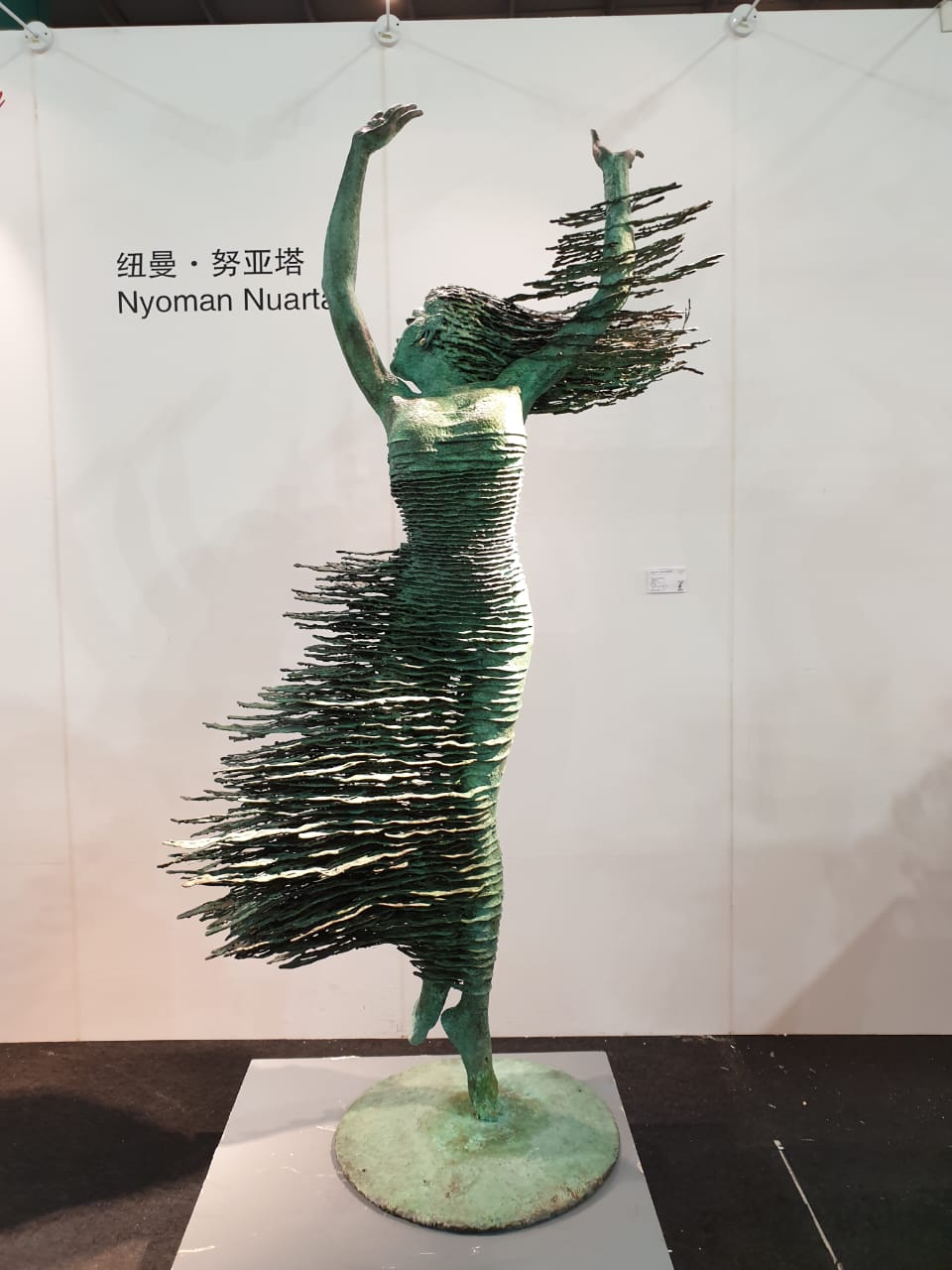
To gain more inspiration,I visited an art expo to try and come up with good artwork to use in my key artwork.
 |
| Fig 1.26 Artwork 1 |
 |
| Fig 1.27 Closeup of Artwork 1 |
 |
| Fig 1.28 Artwork 2 |
 |
| Fig 1.29 Artwork 3 |
Using some of the ideas from the artworks I saw at the exhibition I started to work on my key artwork. I had the idea to draw a girl wearing a graffiti mask, but instead of drawing the mask to add a gestalt effect, using negative space to indicate the mask on the face. I also was inspired by dripping in artwork 1 as it closely represented the drip from spray paint.
 |
| Fig 1.30 Initial Sketch |
I first sketched out the main subject of my artwork. Then I scanned into Photoshop and traced the outline of the sketch.
 |
| Fig 1.31 Coloring in a traced image |
After making adjustments to the initial sketch I started filling it in with color. I started by shading with black and grey.
 |
| Fig 1.32 Finished digital artwork |
The black and grey artwork looked good but did give the look I had in mind so I decided to add some color to make the artwork stand out a bit more. I decided to add a tint of blue as it would complement the Red text that will be added later.
 |
| Fig 1.33 After Changing the color |
I changed the color of the artwork by simply using the Color replacement tool in Photoshop. I was satisfied with the result so I moved on to adding a drip like effect and the masks.
 |
| Fig 1.34 Mask and Drip effect added. |
 |
| Fig 1.35 Adding origami Crane cutouts |
To show the creation of Ideas I used origami cranes. The Origami cranes are created from cutouts in the head to represent the generation of ideas that become a part of their creators. The origami crane in origami resembles change and hope and this is what I believed an idea of a trouble maker represented.
 |
| Fig 1.36 Adding the Title |
 |
| Fig 1.37 Font design |
After I Finished the Artwork I added the Title on top. I used the same title composition from the previous poster. I made slight changes in the design of the text by creating using the marquee tool.
 |
| Fig 1.38 Idea 3 Attempt 1 |
Week 08
After showing my artwork to Mr. Vinod said it looked good but he told me to remove the mask that is there. He also said that the drips make the face look was very zombie-like. However, he liked the idea of the Origami Doves on the head. Following Mr. Vinod's suggestions, I made changes to my design.
 |
| Fig 1.39 Attempt 3 |
Mr. Vinod said that it still looked very zombie-like. He told me Idea wise the design elements still lacked. Due to the lack of time, Mr. Vinod asked me to go ahead with this design. However, I was not happy with the final outcome and the feedback after the removal of the mask. I also wanted to change the zombie-like wires, So I worked on making some changes to the design.
 |
| Fig 1.40 Removing the strands |
The first step was to remove the strands and the elements that didn't go with the design. For my final design, I wanted to add design elements in the form of geometric shapes.
 |
| Fig 1.41 Adding Geometric shapes and mask line. |
 |
| Fig 1.42 Drawing geometric face details. |
In addition to the geometric shapes, I also decided to add the rest of the face details in a very geometric style to eliminate the zombie-like effects. After this added some origami doves flying out of the mouth to strengthen the concept of change and creativity.
 |
| Fig 1.43 Adding Flying doves from the mouth |
 |
| Fig 1.45 Final Design with Titles. |
 |
| Fig 1.46 Final Design |
Mr Vinod said that the final design looks good now but he told me change the font I had used for "Manifesto" and "A Design Colloquium" So this is Final Artwork after those adjustments.
 |
| Fig 1.47 Final Artworks |
Here is the PDF of the Final Design.
FEEDBACK
Week -06
Specific Feedback:
The concept of using Graffiti is good and is fitting for the topic but the current sketches are still not strong enough and the composition of the letters does not look good.
Week-07
General feedback
For the typographic systems, there must be an outline around the spreads and must not be put onto individual pages.
Make sure all the PDFs are visible and made public.
The typeface in the Finding type exercise must be put onto a baseline and the first refinement and final refinement must be visible.
Specific Feedback.
the overall concept is good but the execution is still not hitting the mark. Mr. Vinod told me to try a different approach as this one does look good. I made 2 other designs and asked for feedback and Mr. Vinod said that the artwork is not good, But the composition of the letters is good.
Week 08
The artwork is strong but Mr. Vinod suggested that I remove the mask in the background. He also noted that the drips on the face make it look very zombie-like and the idea isn't clear. He told me to add more design elements in the artworks instead. After redoing the suggested changes Mr. Vinod Told me that now Idea wise the artwork is lacking even though it looks good.
REFLECTIONS
Experiences:
Week 06 - Since I was sick during the week I struggled with coming up with and a solid idea for the Project. I realized that finding things that resemble trouble makers was quite difficult.
Week 07 - Even though I had a concept in mind I had trouble finding a way to execute it effectively. With Mr. Vinod's feedbacks I kept changing my approach constantly. Finding unique images that represent the creators, trouble was not easy.
Week 08 - Because my final designs were not Finalized that week I found myself juggling a lot of work within a short period. Even though I dropped back I made time and began working on a new final design from scratch.
Observations:
Week 06 - No matter how strong a concept is, if the artwork cannot portray the idea visually it is weak. Execution is as important as the concept to effectively communicate ideas.
Week 07 - I Found that I spent a lot of time searching for images and effects I could use in my artwork. These images did not work well most of the time.
Week 08 - Finding inspiration outside of the normal areas helped me broaden my ideas. Instead of looking for inspiration looking at other artists' work helped me tackle the project from a different angle. Instead of Searching for pictures online I decided to save time and draw what was its head and use that as my artwork. This gave me a lot more freedom to explore.
Findings:
Week 06 - Execution is as important as concepts. When coming up with an idea it is important to think about how it can be executed and whether it will work once done so.
Week 07 - I found that it requires a lot of reading and research to come up with the right concept. Finding metaphors that represent a specific title is not an easy and proper understanding of what the title means to come up with a strong concept.
Week 08 - If the foundation of an idea is not strong it is very difficult to execute it properly. Sometimes it is better to start fresh with a better understanding than try to keep amending an old idea.
FURTHER READING
Never use Futura: Unless you are...
This is a great overview of the history of the Futura type and its use over the years. Futura is one of the most widely used fonts. it was interesting to read about its historical origins and use over the years. I have been a huge fan of Futura using it in almost all of my Typography Projects. I believe it is a very Modern font despite its old age. Douglas Thomas addresses the font's history, uses, and misuses. He says that this classic geometric san serif can create rather broad visual languages in a chameleon-like manner, perhaps more so than any other typographic family in existence. One thing that really interested me was on Page fifty-seven which had an intriguing 1939 ad from a printing trade journal with the headline: Boycott Nazi-type! and lists German-made faces and American types available to replace the most commonly used Nazi faces. The book is heavily illustrated with images printed in black, red and blue.


 This is a great overview of the history of the Futura type and its use over the years. Futura is one of the most widely used fonts. it was interesting to read about its historical origins and use over the years. I have been a huge fan of Futura using it in almost all of my Typography Projects. I believe it is a very Modern font despite its old age. Douglas Thomas addresses the font's history, uses, and misuses. He says that this classic geometric san serif can create rather broad visual languages in a chameleon-like manner, perhaps more so than any other typographic family in existence. One thing that really interested me was on Page fifty-seven which had an intriguing 1939 ad from a printing trade journal with the headline: Boycott Nazi-type! and lists German-made faces and American types available to replace the most commonly used Nazi faces. The book is heavily illustrated with images printed in black, red and blue.

Comments
Post a Comment