Advanced Typography Exercises

Riyaz Mohamed Zain ( 0334031)
Advanced Typography
Exercises
LECTURE NOTES
Lecture 1 - Briefing26/08/19 (Week 1)
We started off our class today with Mr Vinod and Mr Shamsul going through the MIB with the class and briefing us in the module. Mr Vinod informed us that this semester the lectures will be conducted by us each week. We were given the task to conduct research on the first topic of the module (typographic systems) in class and do a presentation on it in class. To start of the class was split into four groups and each group was assigned 2 typographic systems. Below are the combined slides of the 4 groups making up the 8 typographic systems.
02/08/19 (Week 02)
No Lecture
09/08/19 (Week 02)
No Lecture
INSTRUCTIONS
EXERCISES
Typographic Systems & Finding
Week 1
Exercise 01
As our first exercise, we were told to come up with 2 layouts for each of the 8 typographic systems. Mr Vinod instructed us that the project must be done on Adobe In-Design and the size of the art boards were to be 200 mm x 200 mm. He also told us that we are only allowed to use very minimal non-objective elements and one color only. The following is are the event details we were to apply into our design.
The Design School,
Taylor’s University
All ripped up: Punk Influences on Design
or
The ABCs of: The Bauhaus and Design Theory
Open Public Lectures:
November 24, 2019
Lew Pik Svonn, 9AM-10AM
Ezrena Mohd., 10AM-11AM
Suzy Sulaiman, 11AM-12PM
November 25, 2019
Muthu Neduraman, 9AM-10AM
Fahmi Reza, 10AM-11AM
Fahmi Fadzil, 11AM-12PM
Lecture Theatre 12
I decided to choose the Title "The ABCs of: The Bauhaus and Design Theory". I then looked into the different Typographic Systems and Sketched out some ideas.
After I did a few sketches for the different Typographic Systems I moved onto Digitizing these designs.
I tried to add very little non objective elements to initial designs and keep them in Black and white So that the designs are more focused on the Typographic elements.
Week 2
Exercise 01 continued
We continued working on our Exercise 1 after receiving feedback on our designs.
General Feedback
Mr Vinod told us that to keep Modular systems from being too irregular we must keep a consistent alignment for all text. we should also make grids on our works to help make the design Precise.
Specific Feedback
Mr Vinod told me that I need to change my designs for Transitional and Bi lateral structure and there were not too appealing . He told me that my other designs looked a good and was approved. During the week I made a few adjustments to my designs in accordance to the feedback I had received and send my updated designs to Mr Vinod. He gave me the following feedback " I’ll give it to you at class. I hope you have been concentrating on your second exercise. That requires a lot of focus "
Week-03
General Feedback
Mr Vinod told us that we should be careful to not get lost in our refinement process and lose the inherent characteristics of the object we used to form those letters.
Specific Feedback
Mr. Vinod And Mr. Shamsul told me that so far, I have been able to keep a consistent design characteristic in my font. Mr. Vinod suggested I look at a work of another student who had a similar twirling font to get an idea as I move along. In addition to that they also suggested that in the letter “X” I should consider keeping the characteristic of the letter having 3 barb wire twists instead of removing them. Mr. Vinod cautioned me that while going forward if I plan to increase weight of the letters, I should be careful not cover up the gaps that has formed in the turns of the wires. Other than that, he told me that I am I heading the right way and that I have a clear understanding of what I want the end result to be and how steps I have to reach that.
I also got feedback for my Exercise 1 Mr vinod told me that the grid and transitional looks good now but to minimize the use of non-objective elements in the design wherever possible in all designs. For the modular system he told me that the grid spacing is still not consistent and it needs some work. The last one was Bilateral he said that i should pay attention to the consistencies in the leading of the type as it looks uneven.
Week 04
Public Holiday
Week-05
Specific Feedback
Mr Vinod and Mr Samsul really liked my Refined letters for Exercise 2. They commended me on the the work and suggested that I create a whole font Based on the design later on in the semester. Mr Vinod however pointed out minor inconsistency errors in the strokes widths of some the letters.
For Part 2 Mr Vinod told me told me that my 2nd design "Power" was strong. He said that the overall design looks good however the shadows in the background are distracting and the subtext has to be moved to another place. I felt that this design however too simple and approached Mr Vinod. he said that I it is harder to make a good Design that is simple than a complex one . He suggested that since have achieved that in the Poster it is better to let that simplicity remain.
Week 02 - Arranging content according to the different typographic systems was challenging. keeping to the rules of systems while making sure it is visually appealing was interesting experience.
Week 03 - I had a hard time managing the work as Mr Vinod had assigned us the exercise 2 while i was still making correction to my Exercise 1.
Week 05- I encountered the same difficulty with time management as I had more work to be done on the previous exercise when the next part was assigned. Once I found the image it was time consuming to find a creative way to place text that inter played with the images.
Week 02 - I found that like me most of the class found the rules of the grid and Modular systems a bit confusing as it was very similar in nature. Since there was quite a lot if information to be placed it as difficult balancing the information within the grid.
Week 03 - Finding a picture with which I could create a strong letter form was challenging. I also struggled cause I had to balance my exercise 1 alongside it
Week 05 - Because the Interplay Exercise was so open I found myself having decide one design from a lot of ideas. I ended up narrowing it down the ideas to 2 different images with different approaches for the exercise
Week 02 - I found myself confusing myself between grid and modular systems.
Week 03 - Even though I found a lot of images that could be used to create the letters. I didn't feel like a strong outcome could have been achieved with a random choice. I found easier as I had clear idea of what I wanted the end product to look like making it easier to refine.
Week 05 - Simplicity is sometimes better than complicated designs.
Week 1
Exercise 01
As our first exercise, we were told to come up with 2 layouts for each of the 8 typographic systems. Mr Vinod instructed us that the project must be done on Adobe In-Design and the size of the art boards were to be 200 mm x 200 mm. He also told us that we are only allowed to use very minimal non-objective elements and one color only. The following is are the event details we were to apply into our design.
The Design School,
Taylor’s University
All ripped up: Punk Influences on Design
or
The ABCs of: The Bauhaus and Design Theory
Open Public Lectures:
November 24, 2019
Lew Pik Svonn, 9AM-10AM
Ezrena Mohd., 10AM-11AM
Suzy Sulaiman, 11AM-12PM
November 25, 2019
Muthu Neduraman, 9AM-10AM
Fahmi Reza, 10AM-11AM
Fahmi Fadzil, 11AM-12PM
Lecture Theatre 12
I decided to choose the Title "The ABCs of: The Bauhaus and Design Theory". I then looked into the different Typographic Systems and Sketched out some ideas.
 |
| Fig 1.1 Sketches for Axial |
 |
| Fig 1.2 Sketches for Radial and Dilational |
 |
| Fig 1.3 Sketches for Grid and Modular |
 |
| Fig 1.4 Sketches for Transitional,Random and Bilateral |
 |
| Fig 1.5 Axial System |
 |
| Fig 1.5 Radial System |
 |
| Fig 1.6 Dilatational System |
 |
| Fig 1.7 Grid System |
 |
| Fig 1.8 Modular Systems |
 |
| Fig 1.9 Transitional Systems |
 |
| Fig 1.10 Random System |
 |
| Fig 1.11 Bilateral System |
I tried to add very little non objective elements to initial designs and keep them in Black and white So that the designs are more focused on the Typographic elements.
Week 2
Exercise 01 continued
We continued working on our Exercise 1 after receiving feedback on our designs.
 |
| Fig 1.12 Axial System |
 |
| Fig 1.13 Radial System |
 |
| Fig 1.14 Dilatational System |
 |
| Fig 1.15 Grid System |
 |
| Fig 1.16 Modular System |
 |
| Fig 1.17 Transitional System |
 |
| Fig 1.18 Random System |
 |
| Fig 1.19 Bilateral System |
For my second attempt I decided to add some non Objective elements and some color to the designs to make it more visually appealing. I asked for some feedback on the improvised design and Mr. Vinod pointed out the Following mistakes in my designs.
For the Bilateral system Mr. Vinod advised me to pay attention to the leading and spacing of the type as it can sometimes be irritating for readers.
PDF of Final Spreads
PDF of Final
 |
| Fig 1.20 Modular Design |
For the modular design Mr told me that reason for the inconsistencies in the design is because of the varying sizes of the grids I was using. That is the for the body text the 1st section (Highlighted in blue) is using 4 grids whereas the 2nd section (Highlighted in red) is using only 2.
 |
| Fig 1.21 Modular Modified |
 |
| Fig 1.21 Bilateral Modified |
Below I finalized designs.
 |
| Fig 1.22 Axial System Final |
 |
| Fig 1.23 Radial System Final |
 |
| Fig 1.24 Dilatational System Final |
 |
| Fig 1.25 Grid System Final |
 |
| Fig 1.26 Modular System Final |
 |
| Fig 1.27 Transitional System Final |
 |
| Fig 1.28 Random System Final |
 |
| Fig 1.29 Bilateral System Final |
PDF of Final Spreads
Type and Play
Week 03
Exercise 02 part 1
For this exercise we were to find and extract letter forms from images. the images can be of either man made or natural structure. After looking through objects to use I decided to extract my text from an image of chicken mesh wires. I found the twisted wire structure very interesting.
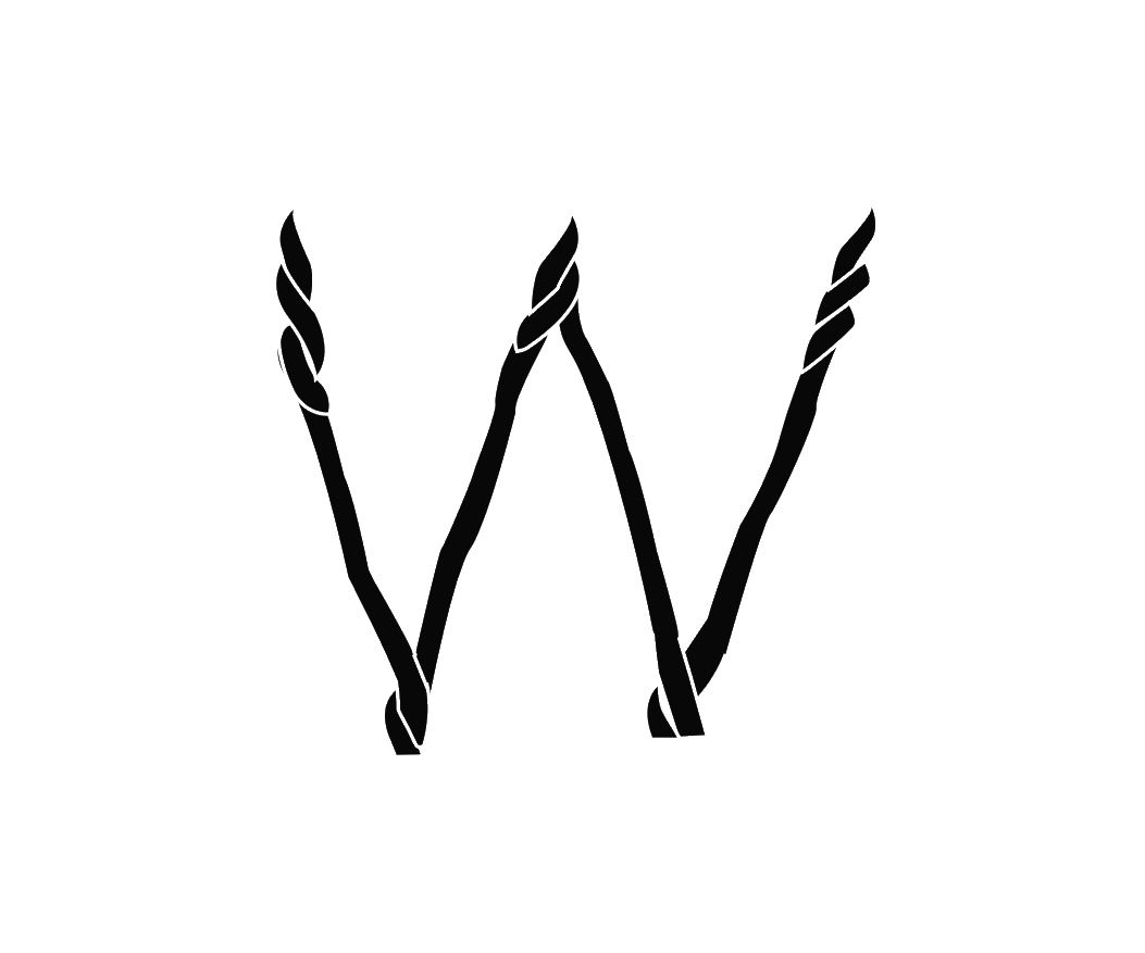
After choosing my photograph I then started looking for letter-forms within the image. I the traced them out using the Pen tool. I was able to find the letters W,Y,O,V,X, and B.
After I traced the letters I then chose Future std Regular as a reference typeface . After arranging the letters the first step was to resize all letters to the same size. After resizing the letters then started my refinement process.
The first thing I did was to create a simple dissection of the typefaces I used for reference. Next I changed the color of my typeface to black and added a stroke outline to the letter. This gave me an idea of how to show the twisted areas on the letters. Using the warp tool I then started to straighten and adjust the letters to fit the dissection guides.
The first refinement to make the letter forms fit into the dissections and make them more consistent.
Week 04
Exercise 02 part 1 Continued
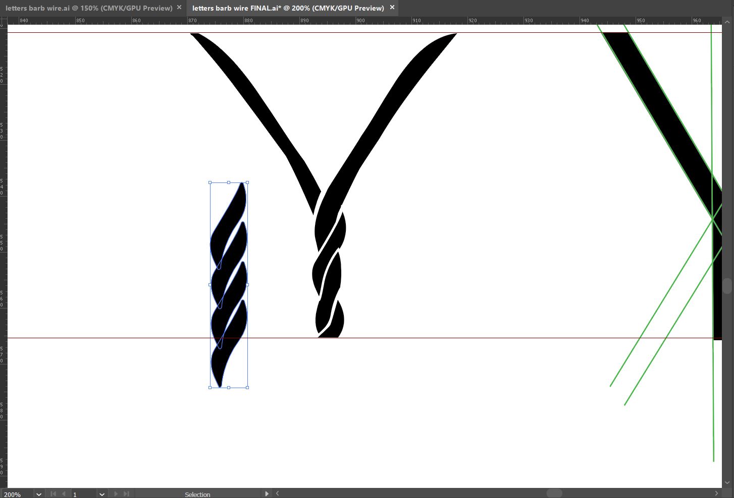
I wanted to increase the stroke weights of the letter forms and round out some the harsh edges on the letters in the 2nd refinement. I also reworked on the letter X based on the feedback I got from Mr Vinod.
The next step of refinement was to refine the twists in the lettering. I wanted the twist to me thicker and more consistent
I went back and traced out one twist that I would use for the letter forms from the original image.
I duplicated the twists and then arranged to represent the twists in the wires.. After this I substituted the original twists with existing ones and got the following result.
The next Step in the process was to get the stroke widths of all the letters to match the widths of twists.
I used the dissection guides I made from the reference letters to make the strokes of my letter forms. I also created guides to measure the widths and angle's of the arms in each letter to ensure consistency on the letters. The results of these adjustments are as follows.
For further refinements I made some adjustments to the angles arms of the letters. I felt that the letters V was too broad and the letter X was too narrow.
I also made some further adjustments on the letter V as there wasn't much twists in that letter V. I also made some minor changes to the stroke of the letters.
I showed the letter forms at this stage to Mr.Vinod for feedback. he told me the letters were really and had reached its final stage. He however pointed some minor inconsistencies in the stroke weights of some of he letters. Based on the feedback I made the Final adjustments to my letters.
Below is a screenshot of the letter forms in the initial stage before refinement and the final stage to compare the change.
Type and Play
Week 04
Exercise 02 part 2
We were also briefed on the second part of the Exercise. The task was to find a make a poster using an image of a man-made structure or object combined with a letter or word. The objective is to combine the image and the text in a way that it looks natural and connected. Some example of such posters as below
To start of I searched up images on https://unsplash.com for images that showed movement. I decided to make 2 different posters adopting two styles.
For my first image I chose an image of a skater doing a flip. I noticed the image portrayed a lot of energy so I decided use "ENERGY" as my word.
The first thing I did was to remove the background using the Quick Selection tool and then using the select and mask to refine the selection. I then added and Solid background color that matched with the character and reflected energy.
I wanted to create a glitch effect on the character. First I created a line rectangle which used make selections in the image.After that I moved the selections sideways to create the glitch effect.
I then added a shadow behind the character and a rectangle around him. I used this to create a 3D effect make the image standout from the background.
I then added the text on top of the image and created the same effect for the wording. Later I cut out parts of the word to make the image interplay it.
The second image I decided to work on was of man Boxing. For the second image I had decided on a more subtle and more minimalist approach.
For this image I chose to use the word "POWER" as the main text. I also chose to use the phrase "float like a butterfly, Sting like a bee" a famous quote by the boxer Muhammad Ali.
First I Removed the background of the original image and added a Gradient color Background. I chose Red as it is color that is usually associated with Strength and Power. I then added Bold Text on Top of the image. I then used the selection tool to create an expanded selection. this will later be cut away from the image to create a subtle outline of the word on the body of the Boxer.
Next I created a Duplicate of the original image on top of text and added a clipping mask it.This effects added the rest of the image inside the text.I then erased parts of the text to make it seem like his hand and leg was on top if the text. Finally I added the quote on the image and a shadow behind the boxer..
Week 05
Exercise 02 part 2 Continued
Mr Vinod liked the 2nd Poster design more but he asked me to some changes to it to make it better. The first one was to remove the gradient in background and keep a solid color. He also asked me to remove the shadow and change the positioning of the quote.
After I made the changes I asked Mr Vinod for feedback. He said that it looked much better with solid color and the text is better positioned, however he said that it could be made better. He suggested I make the background lighter and make the text curve around the image.
To make the text curve I used the pen tool to make a curved path around image. Then added the text along the path to create the effect. I also reduced the intensity of the red in the background.
Week 03
Exercise 02 part 1
For this exercise we were to find and extract letter forms from images. the images can be of either man made or natural structure. After looking through objects to use I decided to extract my text from an image of chicken mesh wires. I found the twisted wire structure very interesting.
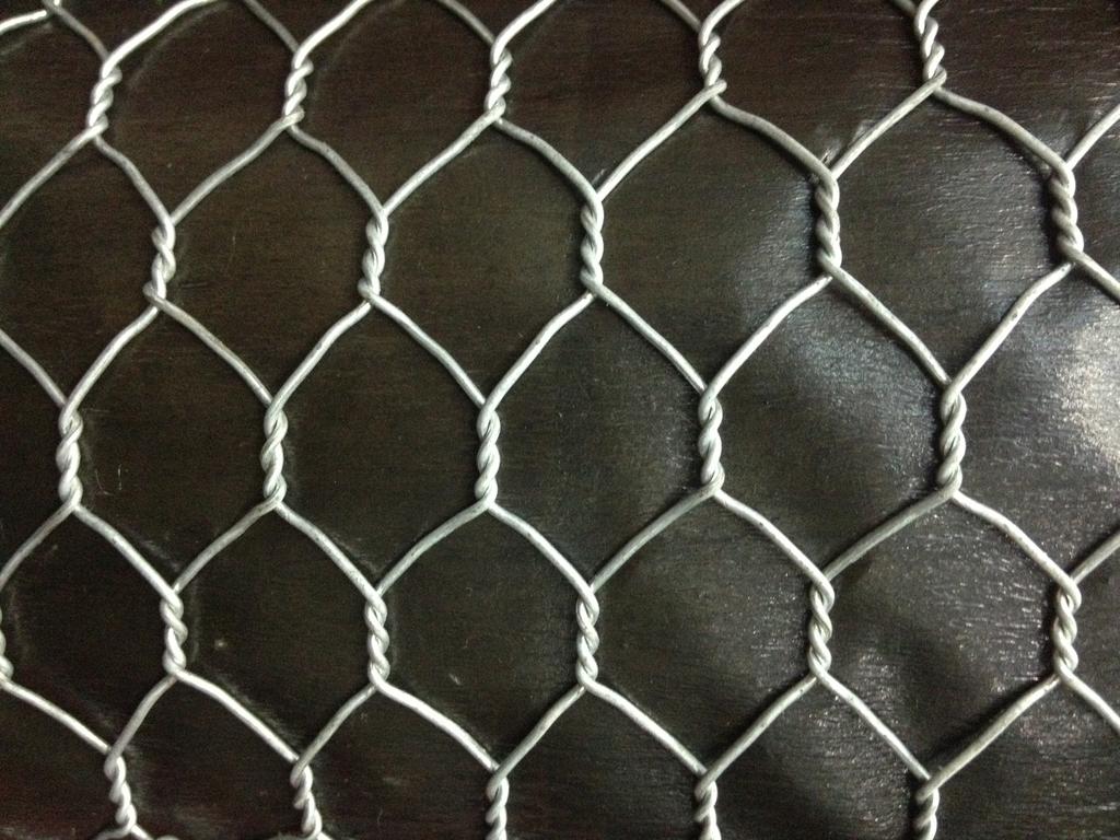 |
| Fig 2.1 Photo of Chicken Mesh |
 |
| Fig 2.2 Tracing letters |
 |
| Fig 2.3 Letter V |
 |
| Fig 2.4 Letter W |
 |
| Fig 2.5 Letter Y |
 |
| Fig 2.6 Letter X |
 |
| Fig 2.7 Letter O |
 |
| Fig 2.8 Letter B |
 |
| Fig 2.9 Arranging the letters |
 |
| Fig 2.10 Resizing Letters to Reference |
 |
| Fig 2.11 changing color and adding stroke |
 |
| Fig 2.12 First refinement process |
 |
| Fig 2.13 1st Refinement |
 |
| Fig 2.14 1st Refinement |
 |
| Fig 2.15 1st Refinement |
 |
| Fig 2.16 1st Refinement |
 |
| Fig 2.17 1st Refinement |
 |
| Fig 2.18 Comparison of original and 1st refinement |
The first refinement to make the letter forms fit into the dissections and make them more consistent.
Week 04
Exercise 02 part 1 Continued
I wanted to increase the stroke weights of the letter forms and round out some the harsh edges on the letters in the 2nd refinement. I also reworked on the letter X based on the feedback I got from Mr Vinod.
 |
| Fig 2.19 2nd Refinement |
 |
| Fig 2.20 Tracing a twists in wire |
 |
| Fig 2.21 Arranging the twists |
 |
| Fig 2.22 3rd Refinement |
The next Step in the process was to get the stroke widths of all the letters to match the widths of twists.
 |
| Fig 2.23 Measuring the consistency |
 |
| Fig 2.24 Creating stroke |
I used the dissection guides I made from the reference letters to make the strokes of my letter forms. I also created guides to measure the widths and angle's of the arms in each letter to ensure consistency on the letters. The results of these adjustments are as follows.
 |
| Fig 2.25 4th Refinement |
 |
| Fig 2.26 narrowing the letter V and adding twists |
 |
| Fig 2.27 Dissection of the letter X |
 |
| Fig 2.28 Dissection of letter Y |
 |
| Fig 2.29 5th Refinement |
 |
| Fig 2.30 Final Outcome |
 |
| Fig 2.31 comparisons of original and refined letter form |
PDF of final Letter forms.
Type and Play
Week 04
Exercise 02 part 2
We were also briefed on the second part of the Exercise. The task was to find a make a poster using an image of a man-made structure or object combined with a letter or word. The objective is to combine the image and the text in a way that it looks natural and connected. Some example of such posters as below
 |
| Fig 3.1 Example 1 |
 |
| Fig 3.2 Example 2 |
 |
| Fig 3.3 Image of skater. |
 |
| Fig 3.4 Removing background and adding solid color |
 |
| Fig 3.5 Creating the effect |
 |
| Fig 3.6 Glitch effect |
 |
| Fig 3.7 Adding shadows and a rectangle. |
 |
| Fig 3.8 Adding the text with Glitch |
 |
| Fig 3.9 1st Poster Design |
 |
| Fig 3.10 Original Image of Boxer |
 |
| Fig 3.11 Masking out the background and adding gradient |
 |
| Fig 3.12 Adding text and making an expanded Selection |
 |
| Fig 3.13 Close up of result from expanded Selection |
 |
| Fig 3.14 Adding a Duplicate Layer with Clipping mask |
Next I created a Duplicate of the original image on top of text and added a clipping mask it.This effects added the rest of the image inside the text.I then erased parts of the text to make it seem like his hand and leg was on top if the text. Finally I added the quote on the image and a shadow behind the boxer..
 |
| Fig 3.15 2nd poster design |
Exercise 02 part 2 Continued
Mr Vinod liked the 2nd Poster design more but he asked me to some changes to it to make it better. The first one was to remove the gradient in background and keep a solid color. He also asked me to remove the shadow and change the positioning of the quote.
 |
| Fig 3.16 adjusted Poster. |
 |
| Fig 3.17 Creating curve text path using Pen tool |
 |
| Fig 3.1 Final poster design |
FEEDBACK
Week-02General Feedback
Mr Vinod told us that to keep Modular systems from being too irregular we must keep a consistent alignment for all text. we should also make grids on our works to help make the design Precise.
Specific Feedback
Mr Vinod told me that I need to change my designs for Transitional and Bi lateral structure and there were not too appealing . He told me that my other designs looked a good and was approved. During the week I made a few adjustments to my designs in accordance to the feedback I had received and send my updated designs to Mr Vinod. He gave me the following feedback " I’ll give it to you at class. I hope you have been concentrating on your second exercise. That requires a lot of focus "
Week-03
General Feedback
Mr Vinod told us that we should be careful to not get lost in our refinement process and lose the inherent characteristics of the object we used to form those letters.
Specific Feedback
Mr. Vinod And Mr. Shamsul told me that so far, I have been able to keep a consistent design characteristic in my font. Mr. Vinod suggested I look at a work of another student who had a similar twirling font to get an idea as I move along. In addition to that they also suggested that in the letter “X” I should consider keeping the characteristic of the letter having 3 barb wire twists instead of removing them. Mr. Vinod cautioned me that while going forward if I plan to increase weight of the letters, I should be careful not cover up the gaps that has formed in the turns of the wires. Other than that, he told me that I am I heading the right way and that I have a clear understanding of what I want the end result to be and how steps I have to reach that.
I also got feedback for my Exercise 1 Mr vinod told me that the grid and transitional looks good now but to minimize the use of non-objective elements in the design wherever possible in all designs. For the modular system he told me that the grid spacing is still not consistent and it needs some work. The last one was Bilateral he said that i should pay attention to the consistencies in the leading of the type as it looks uneven.
Week 04
Public Holiday
Week-05
Specific Feedback
Mr Vinod and Mr Samsul really liked my Refined letters for Exercise 2. They commended me on the the work and suggested that I create a whole font Based on the design later on in the semester. Mr Vinod however pointed out minor inconsistency errors in the strokes widths of some the letters.
For Part 2 Mr Vinod told me told me that my 2nd design "Power" was strong. He said that the overall design looks good however the shadows in the background are distracting and the subtext has to be moved to another place. I felt that this design however too simple and approached Mr Vinod. he said that I it is harder to make a good Design that is simple than a complex one . He suggested that since have achieved that in the Poster it is better to let that simplicity remain.
REFLECTIONS
Experiences:
Week 01 - We had to do a surprise presentation on typographic systems. It was interesting way to start the semester . Mr Vinod also told us that all lectures this semester would be done in the form of presentations.Week 02 - Arranging content according to the different typographic systems was challenging. keeping to the rules of systems while making sure it is visually appealing was interesting experience.
Week 03 - I had a hard time managing the work as Mr Vinod had assigned us the exercise 2 while i was still making correction to my Exercise 1.
Week 05- I encountered the same difficulty with time management as I had more work to be done on the previous exercise when the next part was assigned. Once I found the image it was time consuming to find a creative way to place text that inter played with the images.
Observations:
Week 01 - there was a lot of different ways the typographic systems could be explored and doing research on it in a short period of time did not prove to be easy.Week 02 - I found that like me most of the class found the rules of the grid and Modular systems a bit confusing as it was very similar in nature. Since there was quite a lot if information to be placed it as difficult balancing the information within the grid.
Week 03 - Finding a picture with which I could create a strong letter form was challenging. I also struggled cause I had to balance my exercise 1 alongside it
Week 05 - Because the Interplay Exercise was so open I found myself having decide one design from a lot of ideas. I ended up narrowing it down the ideas to 2 different images with different approaches for the exercise
Findings:
Week 01 - Doing your own research on the topics make it easier to understand the content of the lectures.Week 02 - I found myself confusing myself between grid and modular systems.
Week 03 - Even though I found a lot of images that could be used to create the letters. I didn't feel like a strong outcome could have been achieved with a random choice. I found easier as I had clear idea of what I wanted the end product to look like making it easier to refine.
Week 05 - Simplicity is sometimes better than complicated designs.
FURTHER READING
Lessons in Typography: Must-know typographic principles presented through lessons, exercises, and examples
 |
The author did an excellent job explaining the basic principles using very good visual examples to illustrate the topics. I learned a lot from this book and it had some good advice when it came to designing. Some of the notable ones being
- Don't get too excited with an idea at the beginning of a brainstorm. This will result in getting stuck on one idea. " The idea will still be there for you to pursue and flesh out more when you're finished thinking."
- Aim to to create clear and obvious connections or clear and obvious differences when combining typefaces.
-keep and eye on values of colors so work is easy to see.
The book also talked intensively on new ideas that can be implemented into your designs. such as using negative spaces wisely and ways to effectively merge type and illustration.this really helped me when it came to designing the artwork for exercise 2 part 2 Interplay. The book was also filled with illustrations and examples of what to do, what not to do and what you could possibly do.

Comments
Post a Comment