Interactive Design Exercises

Riyaz Mohamed Zain ( 0334031)
Interactive Design
Exercises
LECTURE NOTES
Lecture 1 - Briefing27/08/19 (Week 1)
Mr Shamsul and Mr Lun, started our class by briefing us on the software's that we will be using for the module. They told us that we can use either Bootstrap,Bracket or Dreamweaver . He then Split our class into groups and assigned each group with the task of finding 3 good websites an 3 bad websites.Each group was then told give a presentation of what made the selected websites either bad or good. some of the qualities being -
Good:
- Responsiveness
- loading Speed
- user friendly
- clear call to action buttons
Bad:
- No clear organization
- Confusing landing page
- Loading takes too long
- Overlapping
- Too many Advertisements
Lecture 2 - UI vs UX
03/09/19 (Week 2)
03/09/19 (Week 2)
Today's class was about UI vs UX design.One of the main differences being that UX would say that a button should physically press down when you click it. UI on the other hand would be a series of buttons and how they would like.
Ux focuses mainly on structure and the layout of the content an how users interact with them. The visual appearance is rather a separate layer over the top.
UI design brings the concepts from interactive design, Visual design and Information architecture. they focus on anticipating users might need to do and ensuring the there elements present that make them easy to access.
Lecture 4 - Extra Markup
24/09/19 (Week 5)
Lecture 5 - Boxes in CSS
01/10/19 (Week 6)
INSTRUCTIONS
EXERCISES
Exercise 1
Web Evaluations and Critics (Week 01)
27/08/19
For this exercise we were divided into groups and asked to asses websites. we were tasked to find 3 good websites and 3 bad websites.
we were to choose the websites and evaluate them based on Pros/Cons, target audience and purpose of the site. Below are the list of websites we chose.
Good Websites
Griflan
The website has a friendly user interface, responsive. Contents are well organized in an easy to use navigation menu. Mobile compatible. The landing page is well designed, the main intentions of the organization is stated right away, all recent projects shows up as you scroll down, then follow their achievements, contact information and social network. Although the downsides may include slow loading as a first time browser because it was huge content for the website to download.
Volk Fi
Message is clear on what it wants to deliver. Website is easy to navigate, user friendly.
Colors compliment each other. However under the "Phone" page, there is an inconsistency in the background color.
Under the "How it works" page, there is an arrow that looks interactable. Might be misleading. A fun page with animation explaning how their product works. Transition to product purchase is smooth and intuitive.
Information under the "FAQ" page has a nice big type, delivering concise information effectively.
iFly KLM Magazine
Intresting layout of information
Interesting website features
Interactive ( press spacebar to show content )
Different contents for different sections ( certain plays videos, certain are photos and captions, certain play music )
Plays music
Have a menu button to show all contents for easy navigation
Aesthetically pleasing
Mobile compability
Bad Websites
Hitparade.ch
Although user experience is superb, there are too much going on that it isn't so user-friendly and accessiblity is poor.
Mauritshuis - the Goldfinch
It has a really bad loading time. The overall website is slow. Although the user interface and the animations are good but the user experience is not good, it doesn't have any call to action and the key information is burried. You can't understand what it's about from the landing page.
Jeremy Holmes website
Key information is buried
very slow/unloadable
Contact information is not readily available
Misleading purpose
Exercise 2
Interference design (Week 02)
03/08/19
Web Evaluations and Critics (Week 01)
27/08/19
For this exercise we were divided into groups and asked to asses websites. we were tasked to find 3 good websites and 3 bad websites.
we were to choose the websites and evaluate them based on Pros/Cons, target audience and purpose of the site. Below are the list of websites we chose.
Good Websites
Griflan
 |
| Fig 1.1 Griflan |
The website has a friendly user interface, responsive. Contents are well organized in an easy to use navigation menu. Mobile compatible. The landing page is well designed, the main intentions of the organization is stated right away, all recent projects shows up as you scroll down, then follow their achievements, contact information and social network. Although the downsides may include slow loading as a first time browser because it was huge content for the website to download.
Volk Fi
 |
| Fig 1.2 Volk Fi |
iFly KLM Magazine
 |
| Fig 1.3 iFly KLM Magazine |
Bad Websites
Hitparade.ch
 |
| FIg 1.4 Hitparade.ch |
Mauritshuis - the Goldfinch
 |
| Fig 1.5 Mauritshuis - the Goldfinch |
Jeremy Holmes website
 |
| Fig 1.6 Jeremy Holmes website |
Exercise 2
Interference design (Week 02)
03/08/19
For our second exercise we were put into groups and we were told design paper prototype UI for a Taylor's University Information Kiosk. Our target audience was to be parents,visitors and new students. we were told come up with one scenario for a design prototype. Our design was to targeted at New students or Visitors who is looking for the way to the library. Below is the video of the Paper Prototype we made.
Exercise 3
Introduction to Html (Week 04)
17/08/19
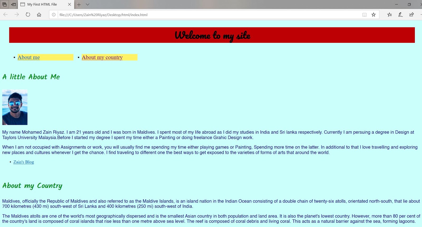
For this exercise we were instructed to create a simple Html code for a website. We were asked to use Notepad to write the code for the website.
 |
| Fig 1.1 Html code on Notepad |
 |
| Fig 1.2 Screenshot of the Website |
We were then assigned to Add more sections and Photographs into our websites. Below is the Website with more sections and a photograph.
 |
| Fig 1.3 Screenshot of Website |
24/08/19
Continued
In today's class we were introduced to Dreamweaver. We imported website into Dreamweaver and started to styles using CSS coding.
 |
| Fig 1.4 Coding on Dreamweaver. |
 |
| Fig 1.5 Linking Google Fonts |
 |
| Fig 1.6 Screenshot Websites. |
 |
| Fig 1.7 Adding tags |
After adding styles onto the websites we then started adding tags and classes onto the websites. This was to link the different sections of the websites such as the back to the Top button and the navigation tabs.
This is the link to final Site
https://zainriyaz.000webhostapp.com/
Exercise 4
Language of the Web (Week 6)
Today we were told how to create CSS file and linking it with an HTML within Dreamweaver. We were taught how to create classes and add styles to design a basic website with formatting. Following the step by step guidance from Mr Lun.
 |
| Fig 2.1 Html Code |
 |
| Fig 2.2 Website before adding the stlyes |
 |
| Fig 2.3 CSS code for Style |
 |
| Fig 2.4 CSS code for style |
 |
| Fig 2.5 Website after first container |
 |
| Fig 2.6 adding segments and float |
Language of the Web (Week 6)
The next exercise was to apply what we learned and create our own website. We were given a set of information and images by Mr Shamsul. We were told that we have to use all the images given and in the websites.
After Figuring out a rough layout for my design using the sample layouts that Mr Shamsul gave us. These the HTML and CSS files for my Website design.
Here are some screenshots of final Layout.
this is the Layout Site.
https://zainlayout.000webhostapp.com
The next exercise was to apply what we learned and create our own website. We were given a set of information and images by Mr Shamsul. We were told that we have to use all the images given and in the websites.
After Figuring out a rough layout for my design using the sample layouts that Mr Shamsul gave us. These the HTML and CSS files for my Website design.
 |
| Fig 2.7 CSS code |
 |
| Fig 2.8 Html Code. |
 |
| Fig 2.9 Landing Page |
 |
| Fig 2.10 Sub Menu's |
https://zainlayout.000webhostapp.com

Comments
Post a Comment