Typography Exercises

Riyaz Mohamed Zain ( 0334031)
Typography
Exercises
LECTURE NOTES
Lecture 1 - Briefing05/04/19 (Week 1)
At the first lecture Mr Vinod Briefed us about the module. He told us about our future assignment and explained what is to be expected for the module. He then introduced us to word press and we were given instructions to setup our blog sites and the formats that is to be followed.
Before the end of the lecture he gave us our first assignment. We were told to create 10 fonts that reflected one personality of our choosing for the coming week. He showed us examples of student work and showed how to create lettering before dismissal.
Lecture 2 - Introduction to Typography
12/04/19 (Week 2)
We started today's lecture with Mr Vinod Introducing us to the basic concept of typography. We learned About how Typography had evolved over 500 years, the history of typography started as scribe moving on to calligraphy and then evolved into typography. Mr Vinod explained to us that before the digital age, typography was a specialized occupation and how in those times proper handwriting was an indicator of a persons educational stature.
We were told that despite the social stigma about designers not being good readers, it is important for us designers to keep ourselves informed and to always bench mark what you see against what you have read.
We then learned about the differences between the Terminologies - Font, Typeface,Type family
where a font refers to the individual fonts within a typeface, such as Georgia bold, Typeface refers to an entire family of fonts that share the same characteristics, and Type family which refers to the many weights within an individual typeface.
Mr Vinod then proceeded to critique the work we were assigned the previous week. After receiving feedback on our works we then moved on to finalizing a font and started to digitize our Font. Before ending the lecture he Checked our digitized fonts and gave us instructions to sharpen our work. We were assigned to sharpen and finalize our digital fonts for the next week.
Lecture 3 - Basics in Typography
19/04/19 (Week 3)
Today we learned about the basics of typography, describing letter forms and going in depth into how into the component parts that form a typeface. Mr Vinod explained to us the many Components and terminologies used to describe these components Such as Baseline, median, Apex, Vortex to name a few. We also learned about the uppercase and lowercase of type and was told about the difference between Capitals and small capitals. Small capital despite being uppercase draw only up to the x height, which is the normal height of a lowercase type.
After the lecture we worked on animating our digitized fonts. At the end of the class Mr vinod gave us our second exercise, Digitizing and animating 6 words in a way that it represented the meaning of the word. We were given a set of Type families to be used for the exercise and were told that we cannot distort the typefaces.
Lecture 4 - Development of Typography
26/05/19 (Week 4)
In Today's Lecture Mr Vinod Spoke to Us About how the the Alphabets that we know today evolved over many years to form the typefaces that we are familiar with today. He explained to us how Typography started with Pheonician's who developed the early letter forms. We learned about how and why lowercase and rustic Capitals lettering was developed. During the start 3rd Century Square Capitals were the most widely used and could be Found commonly on in Roman Monuments and hence the name Roman Capitals. However people began to realize that roman capitals took up a lot of space, at the time goat skin was being used to make scripts and this was very expensive to obtain. For this reason a more compressed version of Type was developed known as the Rustic Capitals.
Cursive hand was the beginning of lowercase letter forms where letters were simplified for speed and was more commonly used in everyday transactions.lowercase was further formalized by the half uncial's which replete with Ascenders and Descender.
After the lecture we were asked to bring out the digitized fonts that we were assigned the week prior, these were assessed and feedback was given individually.
INTRUCTIONS
EXERCISES
Lettering (Week 1- Week 3)
For the our first Exercise we were asked to come up with 10 different lettering styles that represented our personalities. I chose Free as my personality and sketched out 10 different lettering styles that i thought portrayed this personality.
In the beginning i tried using a cursive lettering style. but as i moved along i started to cut out parts the letters in different styles to show the concept of a free personality. In the end i selected the font with dispersing bubbles forming the name.
After feedback from Mr Vinod i worked on the digitized font to touch and sharpen the font. I also re- arranged the bubbles to so that it dispersed cleaner and more freely.
We began to animate out digitized fonts to create Gif. Our animation were to show the quality if the personality that we chose .
We started our work by using illustrator to create multiple frames each showing distinct movements. After creating the frames. After creating the frames we then transferred them into Photoshop to be animated.
Type Expression (Week 4)
In the previous Class Mr Vinod Had Assigned us to create 6 fonts in a way that it represented the meaning of the word.After lectures we received feedback on the work we had done.
I started my exercise sketching out the words to come up with suitable designs.After Brainstorming my ideas i narrowed down the designs and sketched them out more clearly.
I presented the above Digitized Work to Vinds and Mr Shamsul for feedback. They suggested that i change my Angry, and Levitate as it lacked the expression and that their was something odd about the loop due to the shadow effect. Upon receiving feedback for the work I started working towards amending errors and finalizing the fonts to start animations. I made the Corrections to my Designs based on comments from Mr Vinod and Mr Shamsul.
After amending the designs i came to my final 6 Designs. After the approval of the final design by Mr Vinod I moved on to find a word to animate. After discussion with Mr Vinod i decided to animate "Loop".The idea was to show the Little "O" looping around the bigger "O".
I showed my first animation to Mr Vinod and he said that it was getting their but the movement of the bigger "O" is out of place.I started to tweak my animation to make it smoother and to minimize the unnecessary movements in the letters.
In my second attempt their was accidental movements in the art boards which made the word shaky and the end result unclean. So i decided to redo the animation.
 |
| Fig 1.1 Sketches of various lettering styles |
In the beginning i tried using a cursive lettering style. but as i moved along i started to cut out parts the letters in different styles to show the concept of a free personality. In the end i selected the font with dispersing bubbles forming the name.
 |
| Fig 1.2 Digitized Font |
 |
| Fid 1.3 Update Digitized Font |
We began to animate out digitized fonts to create Gif. Our animation were to show the quality if the personality that we chose .
 |
| Fig 2.1 Frames created on Illustrator |
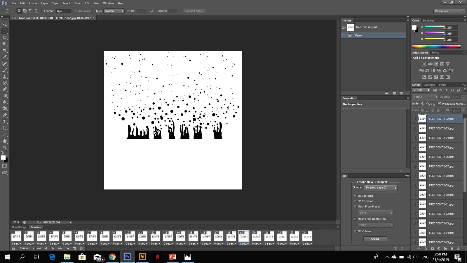 |
| Fig 2.2 Creating animation on photoshop |
 |
| Fig 2.3 Animated font |
Type Expression (Week 4)
In the previous Class Mr Vinod Had Assigned us to create 6 fonts in a way that it represented the meaning of the word.After lectures we received feedback on the work we had done.
 |
| Fig 3.2 Rough sketches |
 |
| Fig 3.2 Final design ideas |
The above Sketches gave me direction to digitize the fonts. I moved on to use the sketches as guideline to digitize the fonts using the Typefaces given to us by Mr Vinod.
 |
| Fig 3.3 Digitized Fonts |
I presented the above Digitized Work to Vinds and Mr Shamsul for feedback. They suggested that i change my Angry, and Levitate as it lacked the expression and that their was something odd about the loop due to the shadow effect. Upon receiving feedback for the work I started working towards amending errors and finalizing the fonts to start animations. I made the Corrections to my Designs based on comments from Mr Vinod and Mr Shamsul.
 |
| Fig 3.4 Finalized Designs |
After amending the designs i came to my final 6 Designs. After the approval of the final design by Mr Vinod I moved on to find a word to animate. After discussion with Mr Vinod i decided to animate "Loop".The idea was to show the Little "O" looping around the bigger "O".
 |
| Fig 3.5 First animation art boards |
 |
Fig 3.6 1st attempt
|
 |
| Fig 3.7 2nd Attempt |
 |
| Fig 3.8 Final art board |
My third and Final animation had 48 art boards, I increased the number of art boards in an attempt to make the animation smoother.
 |
| Fig 3.9 Breakdown of the animation |
 |
| Fig 3.10 Final Animation |
FEEDBACK
Week-02Mr.Vinod told me that cursive is a way to express freedom, and the idea can be seen however the cursive fonts i attempted were more formal rather than free. He Preferred the font that were formed with cutouts and dispersed circles, He suggested i use this font as he saw the idea of a free personality in the way the circles dispersed to form the letters. He also suggested that i add more spacing between the circles to allow it flow more.
Week-03
Mr Vinod and Mr Shamsul both liked my idea of dispersing bubbles and told me to start of with the animation. After finishing the animation and showing them my work , they told me the animation was good and represented the personality .
Week 04
After looking at the 6 fonts Mr Vinod and Mr Shamsul gave their feedback. They told me that the words Angry did not show the expression well enough and that i change it to portray the emotion better. Mr Vinod also commented on the Choice of font For the word "LOOP" . He told me to rethink the use of the shadow effect as it made the word look out of place. After editing the words i then started working on my animation. I decided to work on the word Loop based on comments from Mr Vinod - " He told me that it would look really interesting with the Two O's looping around each other, it could However be little challenging "
REFLECTIONS
Experiences:
Week 01 - In the beginning i struggled with trying to figure out how to show a personality through a font. Week 02 - Digitizing font my font took quite a lot of time due to its intricacy and arrangements. Week 03 - Animating a digitized work requires you to plan ahead and think about how you want the each frame to move to create the final outcome. Week 04 - Digitizing fonts can be quite nerve wrecking as one mistake in movement resulted in redoing all the work again.Observations:
Week 01 - Taking notes is a vital part of the lectures as it can be extremely helpful when you sit down to do the assignments. Week 02 - Digitizing a font is a very time consuming process and requires a lot of patience. Week 03 - Lectures can be very fast paced and packed with a lot of information and hence might not be able to accurately take down notes of everything that is being said. Week 04 - The ideas that people had were very similarFindings:
Week 01 - Quick sketching of few ideas can help to bring out more and better ideas. Week 02- Try to use the time given during the classes to finish as much work as possible so that i can get feedback and improve on them. Week 03 - Lecture slides are available on the Times Website which allows you to look back at what was taught during class and make notes. Week 04 - I should manage time better as i spent a lot of time attempting make my animation and i found myself rushing through the animation in the beginning.
FURTHER READING
Stop Stealing Sheep & find out how type works by Erick Speikermann(Week 1-3)
 |
| Fig 4.1 Stop Stealing Sheep and find out how type works |
This book starts of by giving us an introduction into how type appears in our everyday life, and even though we don't realize it , how important it is. It gives us an idea about the various styles of type and explains how certain type are used to show certain emotions or time periods.
The writer goes on to explain how each typeface has a purpose,for example Script Fonts are used for elegant or grand events such as wedding . He also tells us how typefaces has their own moods, personalities, moods ,style and character, this is the reason why it is important to understand the effect of each typeface so that we can effectively express the right message.
Just My Type by Simon Garfield.
(Week 3-5)
 |
Fig 4.2 Just my Type |
Just my type grabs the reader's attention with a lot of images and typographic content, such as El Lissitzy's famous work "Beat the whites with the red edge". The author then talks about the development of desktop publishing and how Steve Jobs's history in calligraphy influenced the early fonts that Apple created that changed the printing world entirely when they were released on his first Macintosh computer . I found this very interesting as Mr Vinod had mentioned about Steve jobs Interest in Typography in a previous Lecture.
Throughout Just my type, The author discusses the progression of type-technology. and he also mentions the Type Museum in London, where ancient techniques are still on display showing that there are a few true printing presses still in existence. He also addresses current trends and difficulties.He talks about how fonts are often pirated, how they are taken without paying the proper licensing fees or are just downright copied. Arial, in fact, is a considered a copy of Helvetica, although the differences between them can be seen to make the fonts as different "as pineapple is from mango" (p. 221)
In Chapter 18: Breaking the Rules He mostly uses multiple fonts within a single page (sometimes as often as every paragraph) which was interesting to very see.

Wow! Your work is amazing! Would really like to know what the guy behind this beauty looks like ☺
ReplyDeleteThank you !!! : )
Delete